
The Color of Snow
Learn how Clive Tyler uses color in surprising ways to create his winter landscape worlds.
By Aaron Schuerr
It’s not just the grand vista that inspires Clive Tyler to dig out his pastels. “When you contemplate the Grand Canyon, you’re just in awe,” he says, “but then it’s like, now what?” He encourages the viewer to pause, to rest at the mouth of a canyon, beneath a cathedral of aspens, or along a stretch of alpine water. His landscapes depict intimate spaces that encompass acres rather than miles. They invite introspection, exploration, and wonder.
“You can paint the whole world, or you can select,” explains the artist. He’ll ask himself, “What is this painting about? Is it about the water or the cliffs, or the light hitting the cliffs?” Questions lure him, layer by layer, into the landscape.
This article originally appeared in Pastel Journal. Subscribe now so you don’t miss any great art instruction, inspiration, and articles like this one.
Color Jaw-dropper
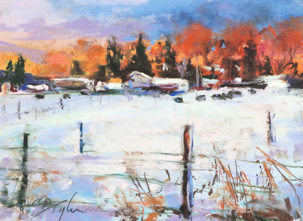
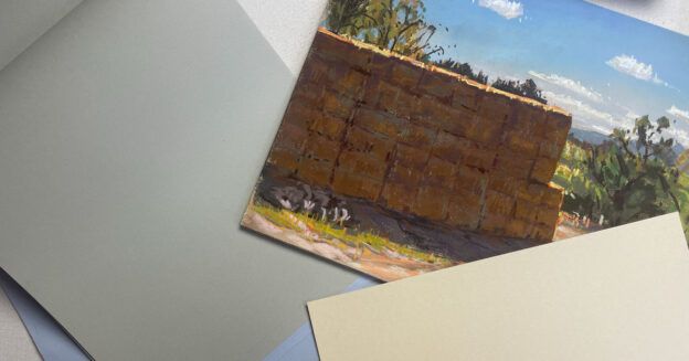
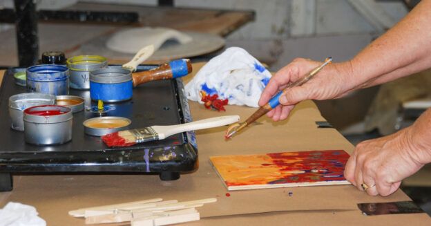
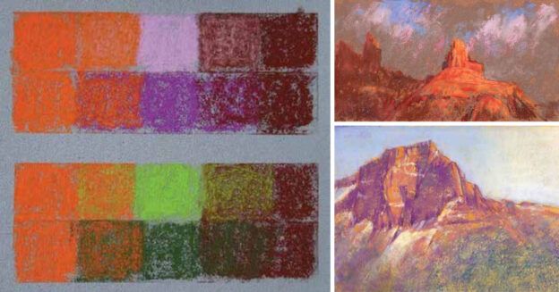
Color also lures him into the landscape. Tyler will experiment with surprising color combinations throughout a painting. “Put down the color that will best enhance the color that you want,” he advises. Building on a firm grasp of color theory developed during his years working in graphic design, his color choices are based on a mix of observation, experimentation, and intuition. For a bright-blue alpine sky, for example, he’ll underlay aqua and lavender beneath sky blue. The point is to develop color combinations that add interest, depth, and complexity to the painting.
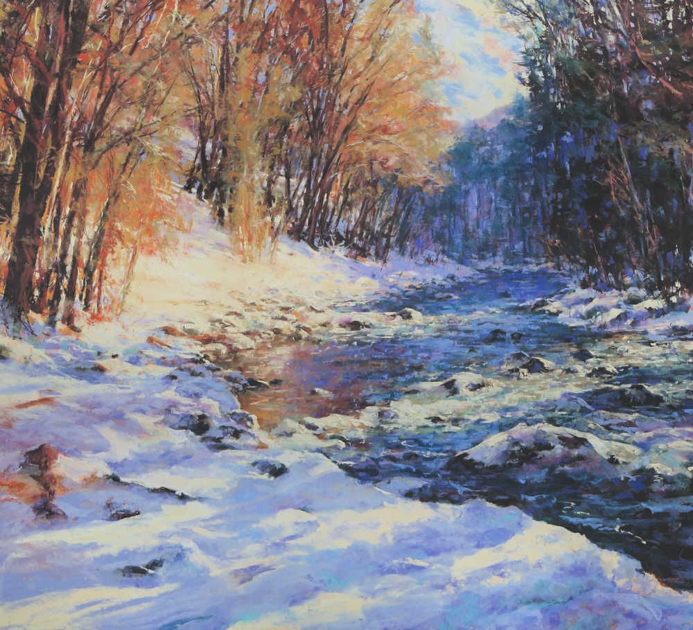
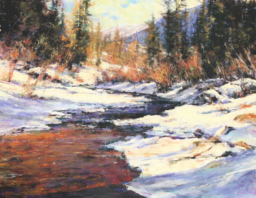
To really set off a work, Tyler searches for an accent color. “In Little Bear Creek, for example, it’s that touch of peach where the sun is coming through and just hitting the willows.” It both complements and contrasts the color of the evergreens. Sometimes an accent can be a touch of the underpainting showing through, or it can be added at the end of the process.
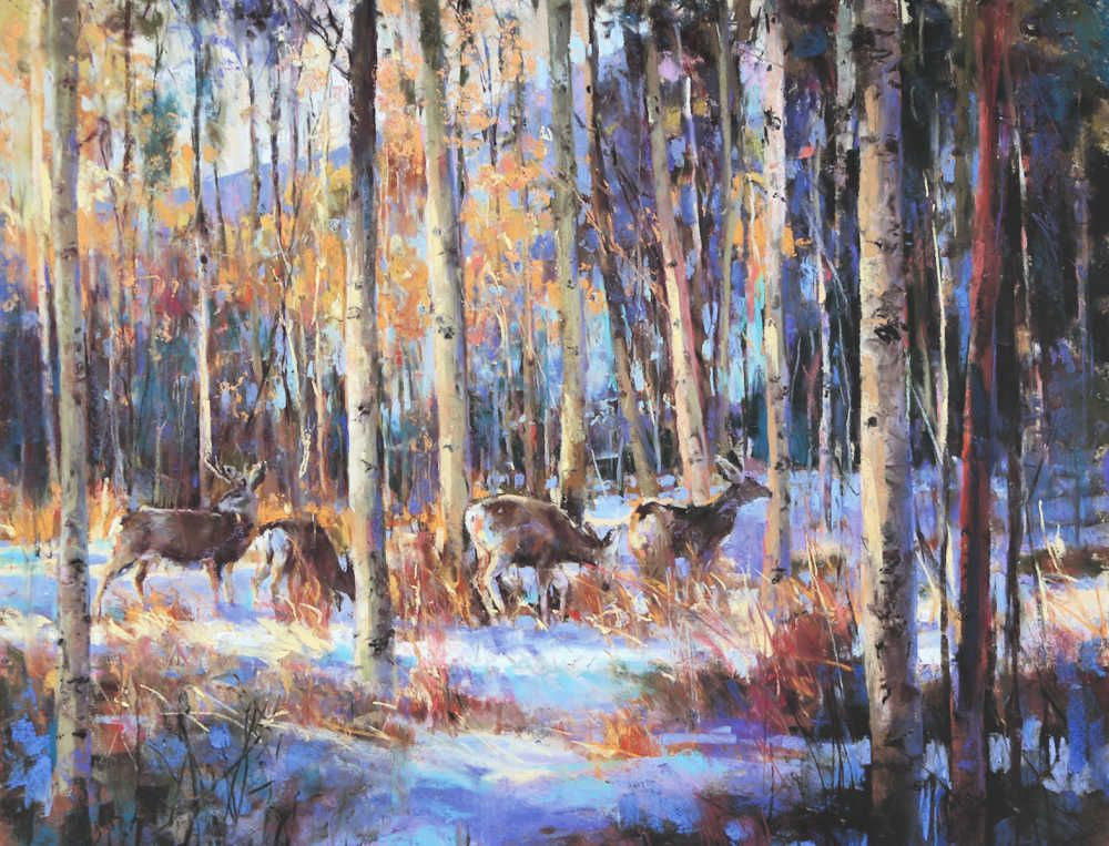
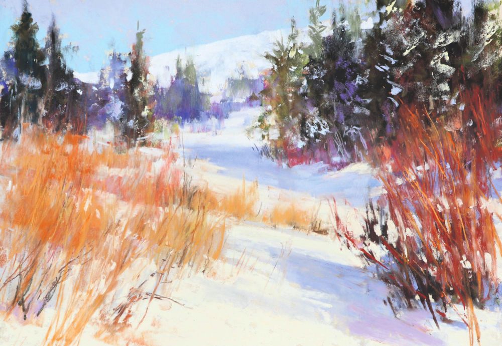
The Secret to Snow
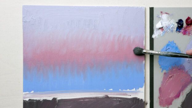
While many think of winter as an austere season, a landscape drained of color, Tyler has discovered a riotous palette in winter. “Snow isn’t white,” he says. “It’s creamy where the sun hits it. It can range from warm gray to periwinkle blue. Snow is water, and water is the most interesting thing to paint.”
Tyler finds endless fascination in the play of sunlight on snow. “Light reflects on it in a totally different way than it does off a rock or a tree,” he says. “Light simultaneously shines into the snow and reflects off it, so you can get a glow within a shadow.” From a design standpoint, snow also simplifies the landscape, providing areas of calm within the complexity of an alpine forest or an aspen grove.
When considering winter paintings, Tyler’s advice is simple: “Get rid of all of your whites.” Because snow is reflective, “it can be warmer up close, or it can be whiter and cooler up close.” It all depends on the light. Students instinctively reach for white to brighten up the snow color. “Bright isn’t white,” Tyler cautions. The addition of white will make sunlit snow look cooler and duller. “You need to get brave and use a warmer color.” Omit pure white from the palette, and the other colors will function as white. To create a deeper space, Tyler looks to the underlying color. The same light layered over a cool purple-gray, for example, will shift and recede.
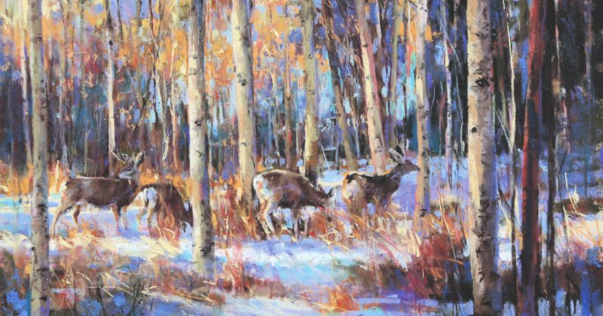
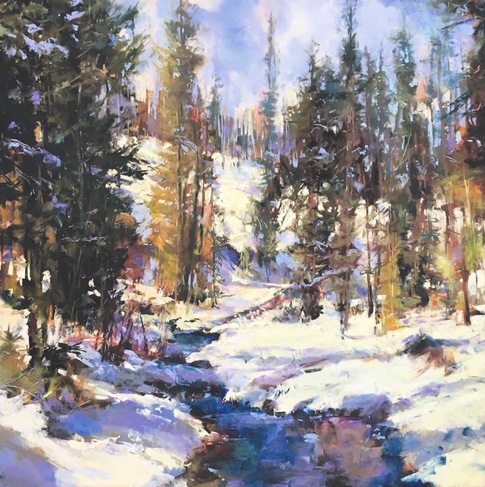
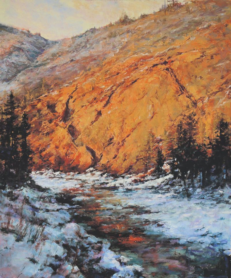
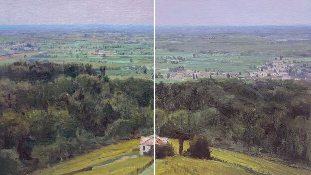
Take a Closer Look
Study Tyler’s snow paintings featured below. What color combinations do you observe? What surprising accent colors have been added for visual interest and attention? And what colors do you actually see where you think you see white? Take note for your own winterscapes.
About the Artist
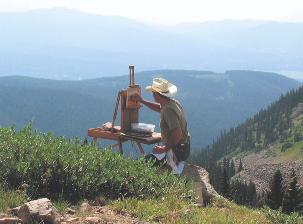
Plein air artist Clive Tyler is inspired by nature and travels around the U.S. to paint oceans, rivers, snow, aspens, and animals. Tyler studied fine art and design at Kent State University, graduating with two BFAs. He’s a master member of the Plein Air Painters of New Mexico and a signature member of the American Impressionist Society. The artist has won many awards and honors and has had exhibitions at museums, Western invitationals, and galleries around the U.S. His artwork can be found in private, corporate, and museum collections.
About the Author
Aaron Schuerr is a landscape painter and plein air enthusiast, based in Livingston, Montana, and a frequent contributing writer for Pastel Journal.


Join the Conversation!